HIGH DPI OFFICE ICONS
Fonts were not released at the time, so we were still making images for High DPI sizes with Photoshop
Microsoft
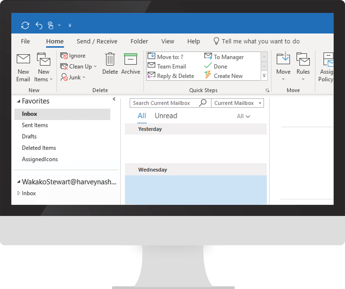
Developed new Office icons with a fresh look and feel for Windows 10. Participated in the first explorations of new designs and colors. From 2016 to 2018, my team worked on creating all Office.com and Office 365 icons. I created icons as well as reviewed final fonts.
While we were redesigning the existing icons in a simpler form, we sometimes had to reduce the number of elements from three to two, but still deliver the same meaning. Not all users like change, so coming up with icon combinations that worked and conveyed the same meaning was challenging.

Design / Create icons with Illustrator
↓
Convert icon into a font using Fontlab
Combine the font file and xml file for color
↓
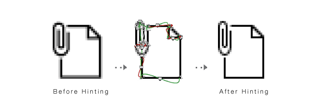
Start hinting
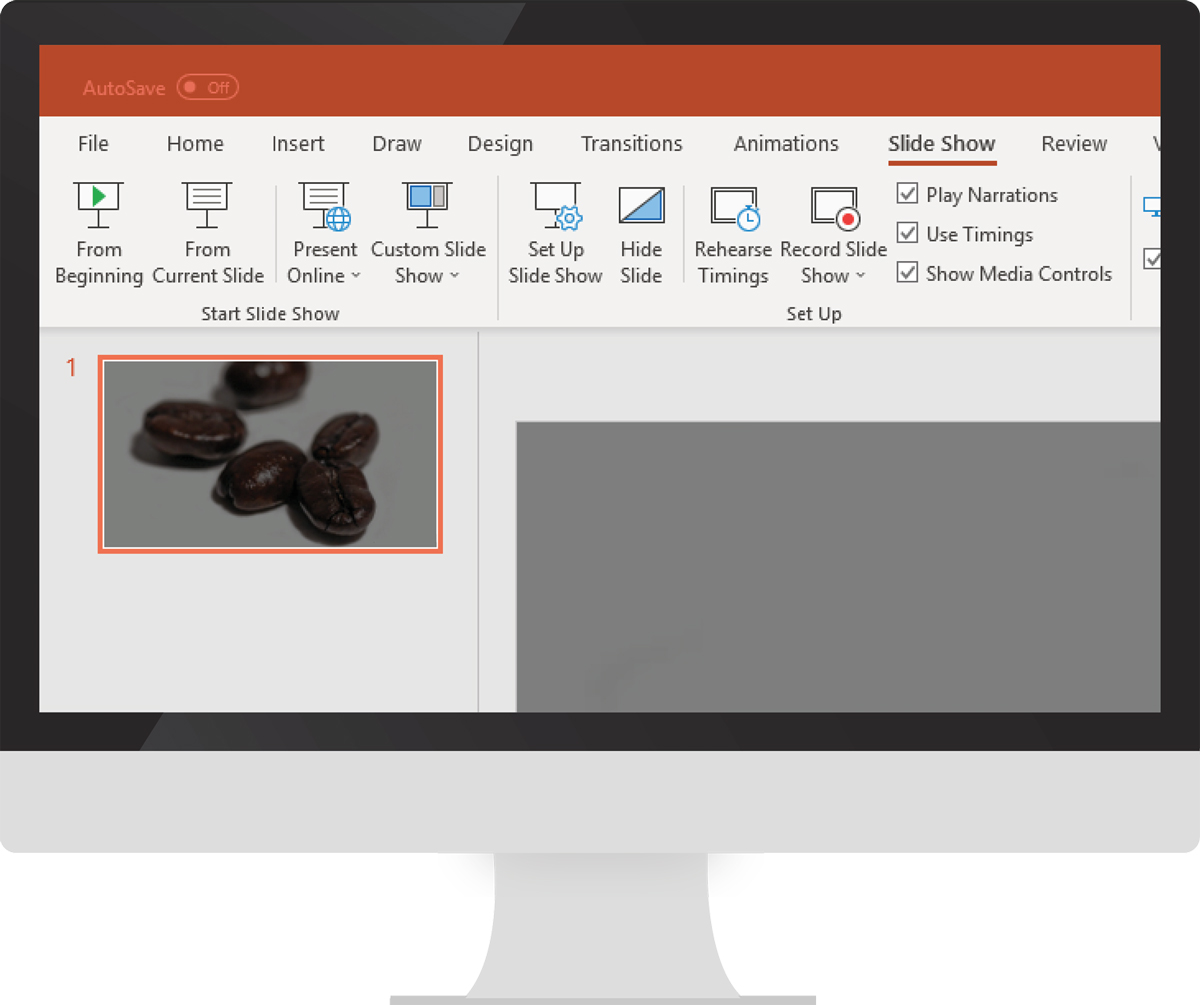
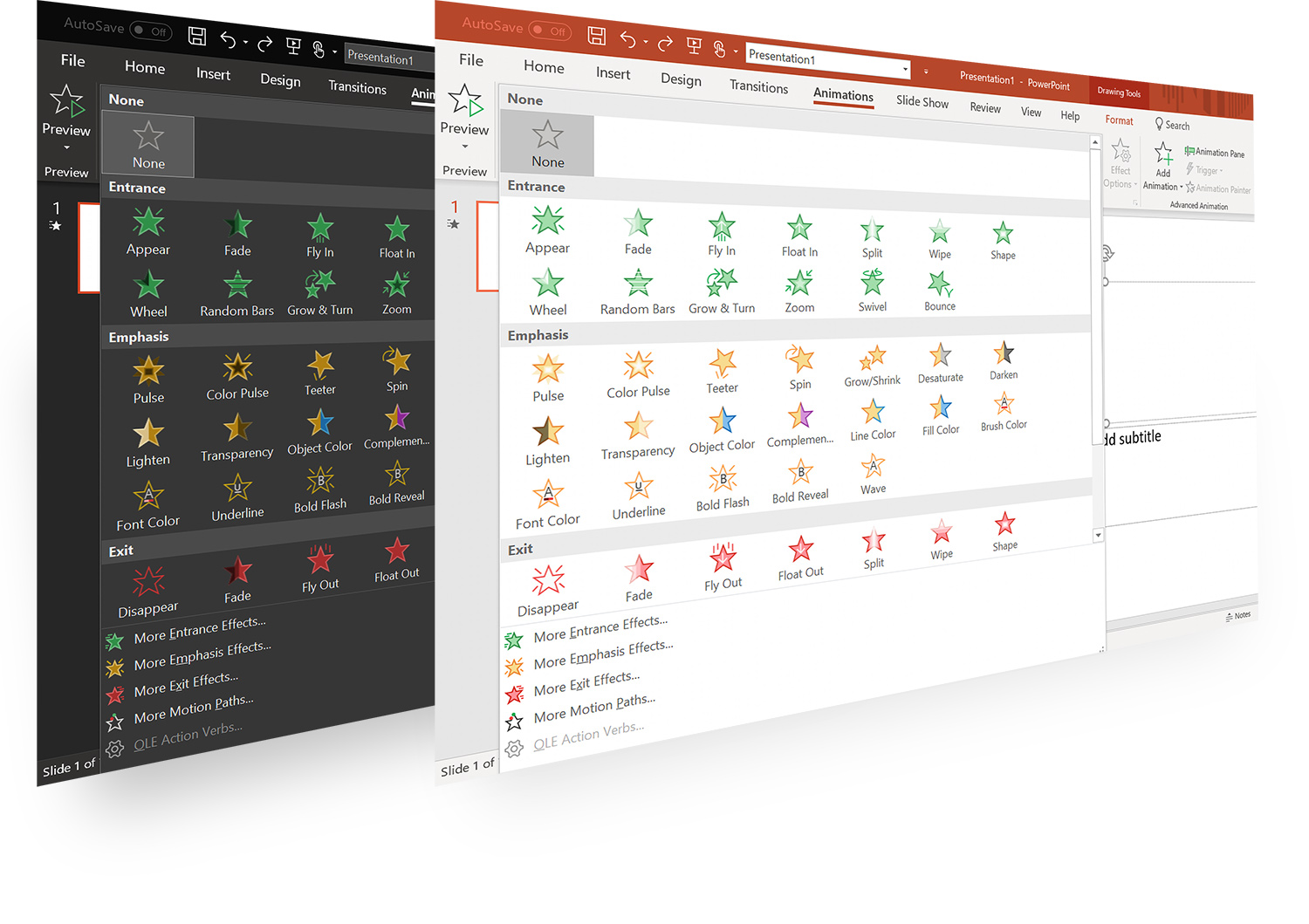
In addition to creating icons, I was responsible for quality control of the final font deliverables for the team. I had to be thorough and pay special attention to the Office icon colors, brand colors, language names, layer orders, and composite layers (monochromatic versions). This set of icons from the Animation tab in PowerPoint is a good example of those elements.
When we created the icons, we needed to create different sizes for different platforms and devices. We also had to consider the monochromatic versions. Without color some of the icons were the same, so we had to come up with ideas to differentiate them from each other. I provided ideas as needed.
❯
When creating many similar icons, xml colors and layer orders can get mixed up, which can change the look or meaning of the icons. In order to prevent this, I had to carefully QA all icons and ensure that they were correct.
❮
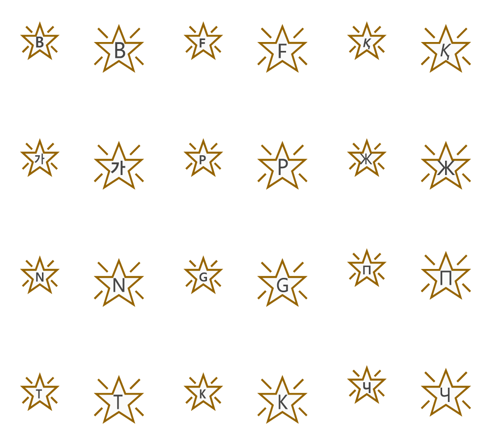
For character icons, we needed to add multiple languages depending on the requirements. For example, 12 languages needed to be added to the "Bold Flash" icon, but only 7 languages for the "Underline" icon. They use different language groups, so I had to make sure that all the languages were included and also that the correct language name or group name was properly defined in each layer for the font.
❯
Fonts were not released at the time, so we were still making images for High DPI sizes with Photoshop
Recreated existing icons with Illustrator and converted them into fonts